Your Hours at a Glance and a Cleaner, Smarter Time-Track Report
Two things changed this month. The timesheet and calendar now show a wave indicator that grows as you log time, so you can see whether you’ve entered enough hours without hunting for a total. The Time-Track report got a redesign too, with continuous scrolling, a cleaner table, and updated charts.
Visual Hour Indicator
Each day column in your Timesheet and Calendar views now shows a wave that grows as you log hours. When you reach your scheduled time, the wave turns green and marks the day as complete. Log more than scheduled, and it turns purple. The week totals row now sits at the top of the timesheet, showing your Regular Working Time, Overtime, Leave Time, and Total for the week. The interface got a refresh too: non-working days appear as narrower columns by default so working days get more room, locations now show as colored circles in the day column, and the leave time icon sits in its own circle over the wave.
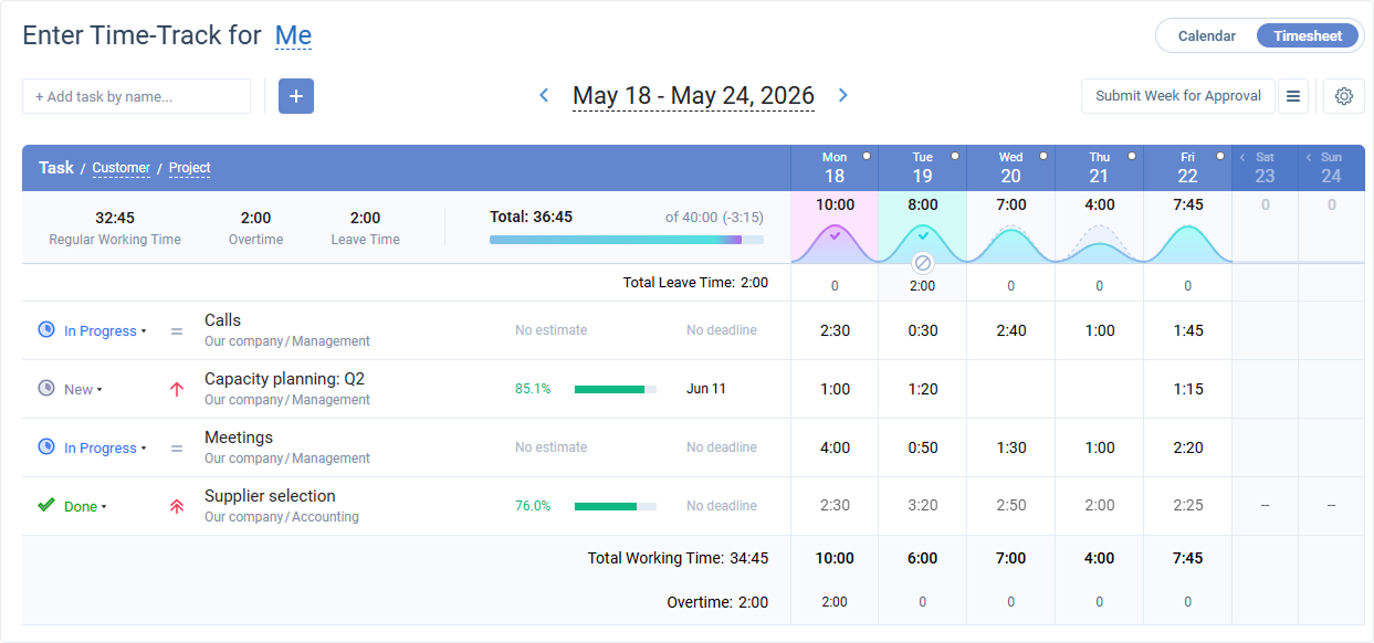
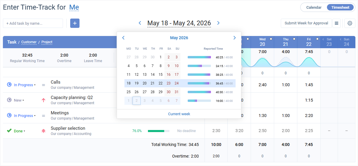
To check a previous week, open the date navigation above your timesheet. The weekly hour totals and the visual day indicator are both right there, so you can see at a glance how full each day was and what the week added up to.
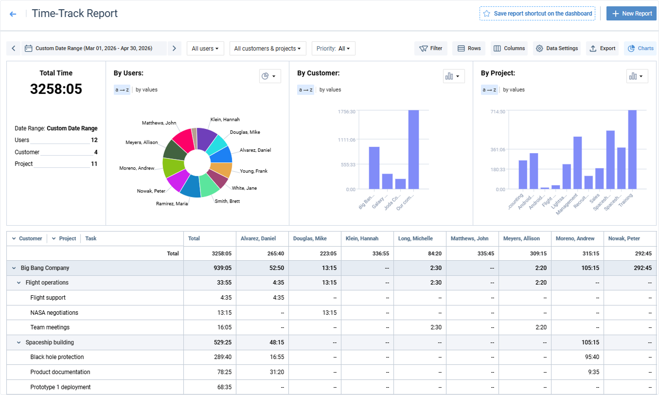
Time-Track Report
The report now scrolls continuously through all your data without page breaks. The table has been redesigned with clearer indentation at each grouping level, right-aligned numbers, and better visual weight so higher-level totals stand out. You can now also sort dropdown and type of work fields by their custom defined order, not just alphabetically.
The charts have a new look too. A clean solid color replaces the gradient, and charts now show aggregated data per grouping level so the visual always matches the table you are looking at.