Data visualization is the graphical representation of abstract information, such as statistics, measurements and figures.
When data is well-visualized and displayed in the form of beautiful graphs, it is easier to comprehend and interpret than when it’s compiled in cluttered tables. In contrast, data analysis with Excel spreadsheets and other types of non-visual charts is exhausting, to say the least. And the more information you want to investigate through a non-visual approach, the more abstract figures to look through, the more challenging, time-consuming and prone-to-error your analysis process is bound to be.
To facilitate business decision-making, slay comprehension fatigue and arrive at informed conclusions with less effort, you need practical tools that allow for data visualization. actiTIME is one of them. It has three core features to help you simplify performance analysis and make higher-quality decisions:
- Kanban board
- Charts
- Real-time reporting widgets
This article will walk you through everything that each of them has to offer. But first, let’s see why data visualization is so essential for business and project management.
Data Visualization for Sense-Making and Efficient Communication
Besides letting us connect the dots and understand the meaning behind abstract information, even such simple visuals as histograms and pie charts allow for successful communication of findings.
According to the Interaction Design Foundation, our data hides important stories, which cannot be discovered, grasped and shared with others if numeric values aren’t properly visualized. This is the case because visuals in any form attract attention. They help memorize information and get its meaning across to the audience with much more ease than spreadsheets with raw figures.
Let’s take the Billing Summary Report as an example:
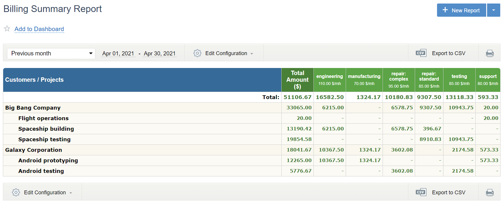
This table shows the amount of profit that Company X acquired in April 2021. It contains accurate figures and is convenient enough to review how much money was earned that month:
- By clients (i.e., Big Bang Company and Galaxy Corporation)
- By projects (i.e., Flight operations, Android testing, etc.)
- By types of work (i.e., engineering, testing, support, etc.)
- In total
Nevertheless, the table format complicates the comparison of different data sets. Plus, it’s not handy if you want to identify trends, analyze patterns and reveal the story behind the data.
In contrast, the below chart allows you to do just that rather effortlessly.
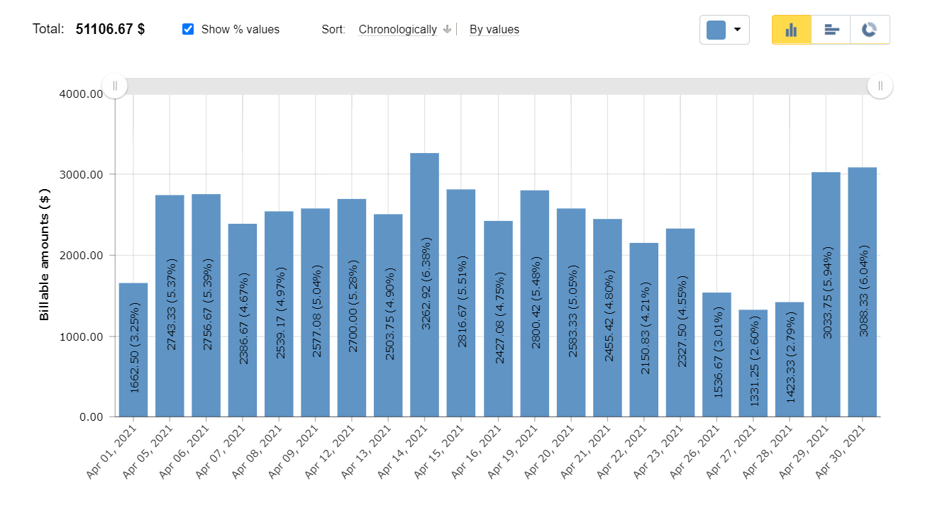
Just a superficial glance at this column chart uncovers the following facts:
- The highest amount of money was earned on April 14.
- The company’s revenue rate mostly trended upwards during the first half of the month and downwards during the second one.
- There was a sharp decline in the volume of money earned from April 14 to April 28, yet the situation began to improve on April 29.
Without a thorough and time-consuming analysis, all these trends and changes are impossible to comprehend if data is simply showcased as figures in plain tables. But when it’s presented visually, our brains grasp the relationships between different numeric values almost immediately.
So, data visualization is vital if you want to interpret complex quantitative information and help others understand your findings without much trouble. And here’s how actiTIME can promote uncomplicated performance data analysis and enable you to communicate productivity results to your team members and customers efficiently:
Real-Time Reporting Widgets
actiTIME’s report widgets turn such raw performance data as work hour summaries into visually striking sparkline charts. The widgets display how the data is trending in real time and update the information every five minutes. Therefore, they are perfect for monitoring how your team is using its time resources and let you see how the progress changes over a specific period.

Besides providing you with time tracking summaries, actiTIME widgets can:
- Contrast different data sets (e.g., working hours vs. leave hours)
- Specify how your current data compare to previous periods
- Clearly indicate if it’s trending upward or downward
You can also configure your widgets to display data for any project, customer, team or period of time within a one-year limit. By creating separate widgets for different projects and teams, you will be able to weigh them up side by side, identify which of them consume more resources and then make conclusions accordingly.
Visual Charts
In actiTIME, you have an option to summarize and compare your versatile data in the form of pie, column or bar charts. In addition to working hours, approved working hours and leave hours that can be displayed on real-time widgets, visual charts may exhibit the following information:
- Paid time off balance
- Sick days balance
- Overtime hours
- Cost of work
- Billable amounts
They also provide you with multiple ways to categorize and present performance data. For example, you can showcase only time tracking values related to particular team members, projects or customers. You can also sort the information in a chart by users, departments, projects, types of work or even days, weeks and months.
More specifically, it’s possible to generate a chart that will show you how much profit different clients brought to your business within a selected timeframe. Or you can create charts that help you compare the totals of costs incurred by various projects and analyze the use of time resources by employees.
Thanks to a beautiful and straightforward design, these charts are an excellent tool for communicating performance results to your team members and clients.

Kanban Board
As a lean workload management methodology, Kanban aims to balance task demands with available workforce capacity. To make that happen, it employs a visual tool – a structured Kanban board divided into several columns that represent different work progress statuses, e.g., open, in-progress, under review, done.
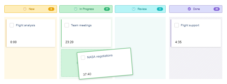
Moving tasks across the board, employees indicate which stage of the work process they’re currently at and, this way, let managers monitor project progress and make informed workload management decisions without a hitch.
In actiTIME, it’s possible to create your own task progress statuses and perfectly align the Kanban board with your team’s actual workflows. Flexible configuration and clear-cut visual elements make the Kanban board an ideal project communication tool.